A Comprehensive Analysis of Data Visualization Reports

In our experience, agency marketers seek a data visualization report for three reasons:
- They’re burned out from creating reports manually on spreadsheets like Excel
- They want to show a higher level of professionalism in reporting
- They work with clients who struggle to make sense of their marketing performance
If you’re struggling with these challenges, great news, this post is for you.
Today, we’ll show you how data visualization reports benefit agencies and how you can create one seamlessly through automation.
- Understanding Data Visualization in 30 Seconds
- The Benefits of Data Visualization Reports for Agencies & Clients
- How to Create an Influential Data Visualization Report Clients Love
- Build a Data Visualization Report with DashThis
- Automate Your Reporting Today
Note: This guide explores the best data visualization tool for marketers. If you’re an analyst, IT user, or data science graduate, we recommend other business intelligence solutions like Tableau or Microsoft Power BI.
Understanding Data Visualization in 30 Seconds
Data visualization summarizes raw data into digestible graphs and charts, so you can quickly understand what’s happening in your business across different periods and make better decisions.
In terms of design, a data visualization dashboard is wildly similar to infographics. Both visual content convey complex information into bite-sized chunks.
Take this SEO and backlinks report created on DashThis, for instance. Note how it outlines a boatload of SEO metrics and KPIs in one interface.
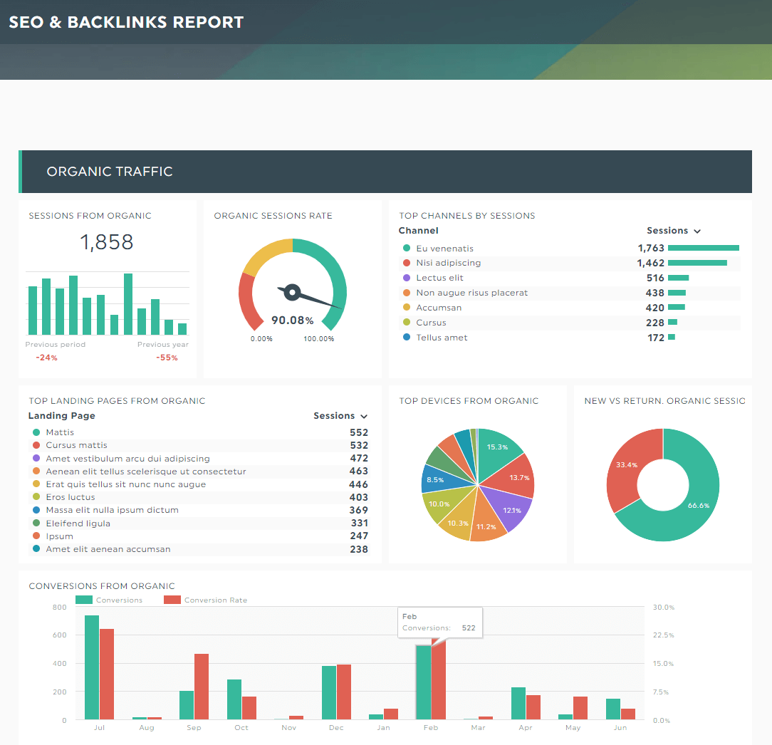
It takes only seconds visualizing data
In just five seconds, the pie charts and bar charts help you identify the top channels, landing pages, devices used by your target audiences, and organic conversions across the year.
The Benefits of Data Visualization Reports for Agencies & Clients
In this section, we look at why you should use data visualization dashboards in client reporting. We’ll also briefly walk you through several tutorials on what it's like to create them on our intuitive visualization software, DashThis.
Data comprehension (a plus for non-marketers)
Visualization demystifies complex data sets, simplifying data analysis and distilling data insights with zero hassle.
It’s a massive time-saver, whether you're a data scientist dealing with big data or a client with zero marketing expertise, wondering how your marketing efforts impact the bottom line.
Tip: ensure you’re using the right chart types and visualization techniques.
For example, area charts are best for displaying patterns of multiple variables. Whereas scatter plots are ideal when comparing different types of data.
If you want to track trends across a period—say the number of transactions over the year—use line charts. You can easily change it on the dashboard editor on DashThis.
Hover to the metric and click Edit Widget > Data Display > Line.
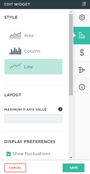
Click Save.
Identify patterns and trends at a glance
Quickly compare current performance against historical benchmarks. It takes seconds to identify patterns, trends, and outliers.
Improved decision-making with zero guesswork
When data points are presented visually, quickly grasp key insights and suggest informed decisions to clients.
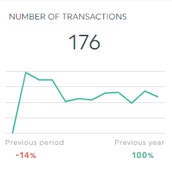
For example, if we were to look at this line graph, we’d know right away the number of transactions has been erratic over the months.
If there’s no significant drop in the number of product views and adds-to-cart, we might deduce there’s something wrong with the checkout page and recommend the relevant steps to optimize the checkout flow.
Effective communication for online and offline
Data storytelling wows on the big and small screen.
Quickly switch to view mode the next time you present data in webinars or in-person team meetings. Hover your mouse over specific data points and explain how they change over time.
It gives clients an easy-to-understand overview. Right away, they’ll know how each metric impacts revenue growth.
Alternatively, present the dashboards online.
Add notes and comments in the report itself.
With all notes in one place, clients can easily access additional information on a particular metric without scrambling through their emails.
Here’s how you can create a note on DashThis. In edit mode, hover to a metric you want to expand on and click the dropdown icon > Add Note.
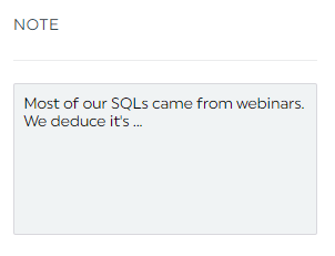
Click Save.
This note will appear as an unmissable orange tab in view mode. Once clicked, your note will appear on the right side of the client’s screen.
How to Create an Influential Data Visualization Report Agency Clients Love
You’ve established new goals for the quarter and determined the KPIs and metrics to achieve them.
Now all that’s left to do is to choose a data visualization tool.
Look no further than DashThis.
Gather data across multiple channels into one beautiful dashboard in the blink of an eye. Unlock unlimited users and client accounts, no matter what plan you’re on.
Here’s how it works:
*tip: ensure you have permission to access the account before proceeding!
- Select a pre-made report from over 40 customizable templates
- Connect your data sources with DashThis (note: DashThis integrates deeply with 40+ connectors; you don’t need to worry about its functionality)
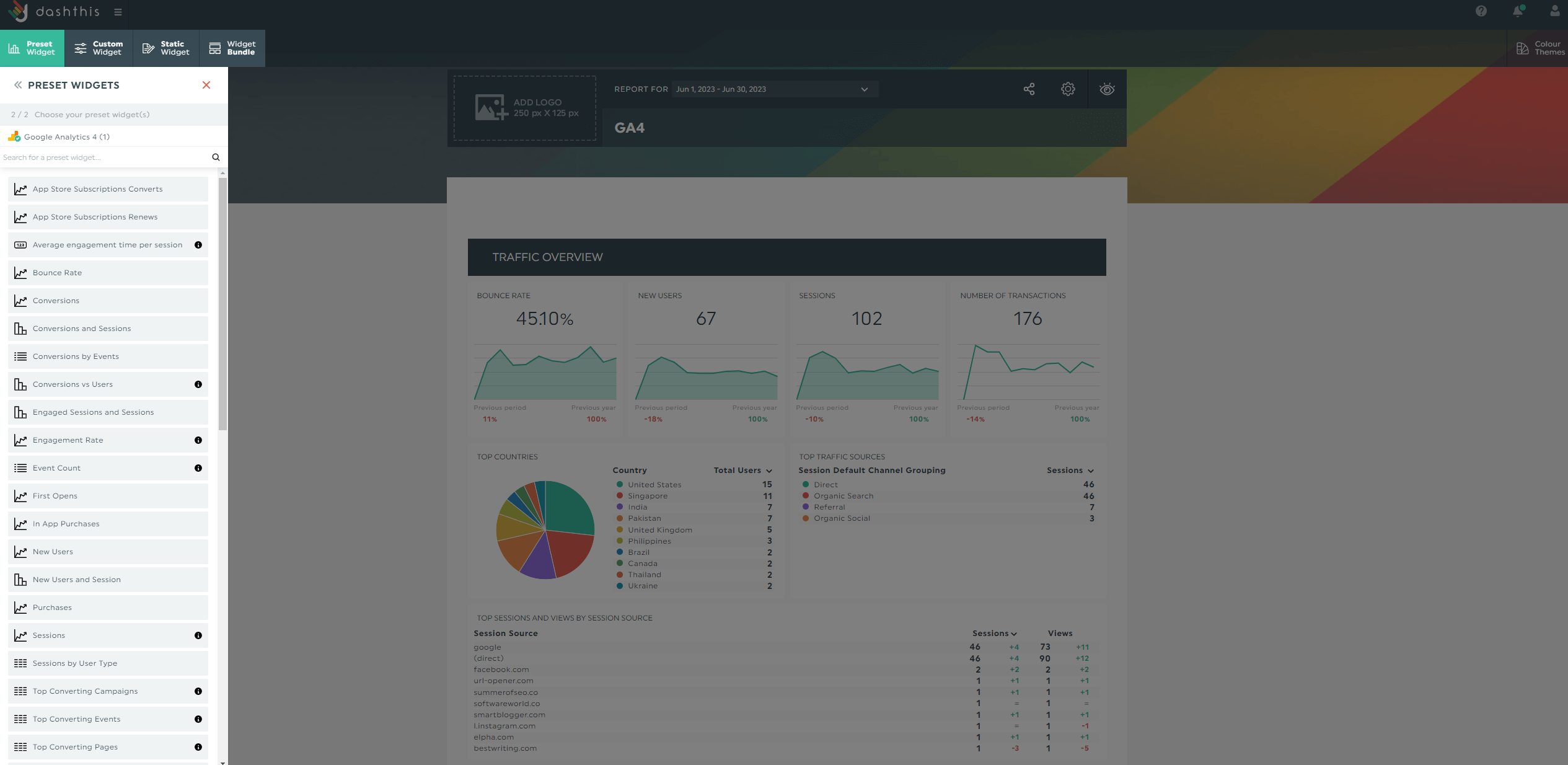
- Pick your metrics in Preset Widgets
Wait for a few seconds, and the selected metrics appear on the right side of the screen. Drag and drop them to form a cohesive look.
Schedule your marketing reports via an automatic email dispatch with a frequency of your choice (e.g., weekly, biweekly, quarterly).
Click the Sharing Options icon > Share by Email.
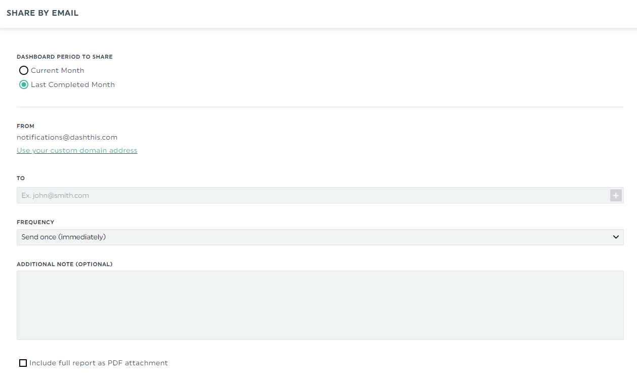
Alternatively, send a shareable URL link for stakeholders to view the interactive dashboard in real-time.
Both sharing options let them view their data analytics at different periods.
DashThis is the easiest reporting tool. Try it free for 15 days to automate your data visualization reporting today.
Build a Data Visualization Report with DashThis
These data visualization examples impress on big and small screens. Make your case during client meetings or share them effortlessly via a set-it-and-forget email dispatch.
GA4 report template
Whether you want to track data history from the old GA or analyze individual page performance, this GA4 report will help. Monitor metrics with custom dimensions, compare campaigns, understand specific user groups, and more.
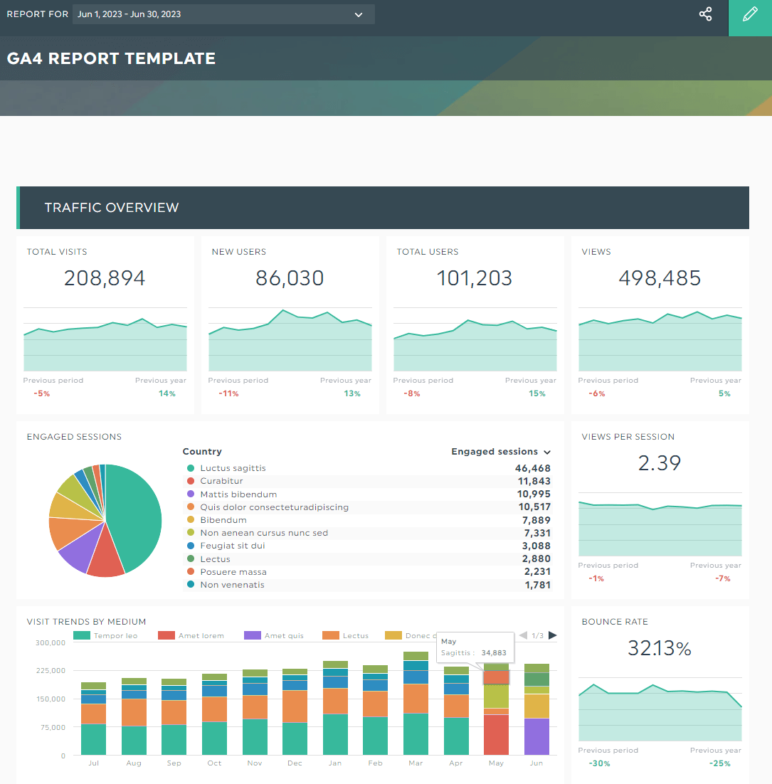
Grab this Google Analytics 4 report with your own data!
Social media report template
Social media shouldn’t be treated as an afterthought. Grab this social media dashboard to bring your most important social data into one place. Better yet, gather every data—paid, organic—to drive overall strategy!
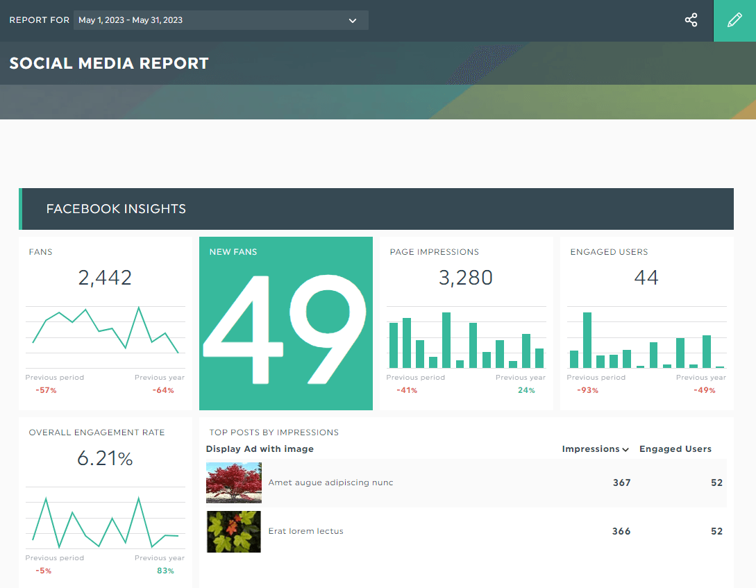
Grab this social media report with your own data!
Automate Your Reporting Today
Data visualization reports make sense of your messy data, set the gold standard in reporting, and gain back hours of your time.
DashThis is the easiest reporting tool. Bring your most important data into one dashboard, automate distribution, and enjoy unlimited capabilities, users and client accounts, no matter your plan.
Pricing starts at $44/month when billed annually. Try it free for 15 days today.

See how you can visualize your data with Dashthis
Read More

Don’t miss out!
Follow us on social media to stay tuned!
Automate your reports!
Bring all your marketing data into one automated report.
Try dashthis for free