DashThis: new branding, better reporting!

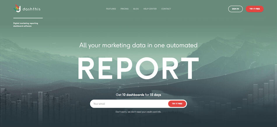
If you’re a DashThis user, you already got a good glimpse at our rebrand in our system. Now, our website has joined the party! We’ve finished rebranding all our platforms: website, social media, ads… everything matches!
We want to take this opportunity to explain a little bit about our motivation for the change, our vision, and what it all means for DashThis as a business and reporting tool.
Why the rebrand?
The reason we rebranded is the same reason we do anything at all here: to make life easier for our clients, as well as that of our future clients. Our rebrand was partially a reinvention, but mostly a clarification; we want to make it easy for anyone who lands on our site to know exactly what we do, why we do it, and how we can help them.
The year 2016 ended with a bang: everyone who was already a DashThis user got to see and experience the rebrand first, in the tool itself. The reason for this rebrand was to lay the groundwork for all the new features and product updates that we’re rolling out… and will continue to roll out on a continual basis.
Now, with the beginning of 2017, it’s crucial that our website reflect this new image. The DashThis tool is going to be just bursting with new features throughout the course of the year… our website needs to echo this evolution.
As we always say, everything we do is for our clients. This rebrand is all for you; we want you to be proud of using DashThis, and proud of every single digital dashboard that we create, together.
What this new look means
The DashThis reporting tool was created with two ideas in mind: we made it simple in order to be accessible to all levels of marketers, all while retaining the level of professionalism and accuracy necessary for the job.

It was therefore crucial that our new branding show these priorities immediately. As soon as you land on DashThis.com, you know you’re in the right place; right away, you know that we’re in the business of automating your digital marketing reports. If nothing else, this is the most important thing for a first-time visitor to see.
What we want you to understand at first glance is: we’re here to make your reporting process easy. Creating digital marketing reports can be tedious and time-consuming, and it’s often more complicated than it needs to be.
That’s what we’re here for. To make it… uncomplicated.
DashThis is accessible to everyone
Our reporting tool is built around the KISS principle: Keep It Simple and Straightforward. We aren’t made for complicated data analysis. We’re made for digital marketing specialists, be they in digital agencies, within a larger corporation, or anywhere in between. These specialists need to create reports to demonstrate the effectiveness of their marketing strategies over time; they have way better things to do than spend time copy and pasting data from dozens of marketing tools.
There are a myriad of tools available to help automate your reporting process. And while they can offer tons of features and possibilities, frankly, they can be overkill if what you need is a simple, easy-to-use system that creates beautiful dashboards for you. There’s no need to get lost in the realm of intricate data analysis tools.
That’s where we come in. We make it easy. Plug in your data sources, create your dashboard layout (with either our preset templates and widgets or custom ones), and let us get all the data you want, whenever you want.
Easy!

Data you can trust
As much as we’re built on the premise of ease-of-use, this doesn’t mean the tool is lacking in either capabilities or accuracy. On the contrary.
Digital marketing is not one-size-fits-all. Different markets require different strategies, and each strategy therefore requires a different reporting style. While our system includes a myriad of preset templates (from dashboard report types down to the widget level) to speed up the process, it also includes all the customizing features you need to create a dashboard that fits your needs to a T.
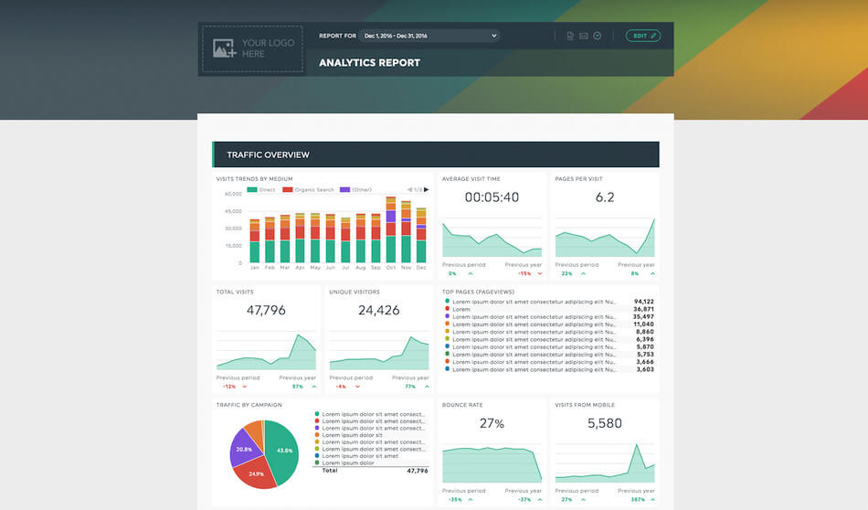
Reporting doesn’t need to be complicated, but it does need to be precise. That’s what we do. Precise, easy reporting, shown in beautiful dashboards that are fun to look at and simple to understand.
Therein lies our design inspiration. Our new website is like our dashboards: simple, to the point, yet beautiful to look at.
It shows who we are, as people
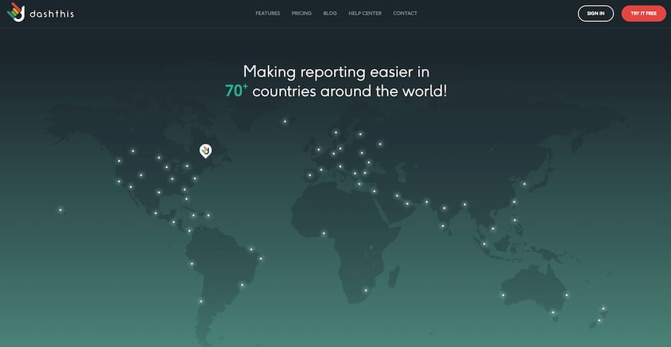
While our website’s first task is to inform you on what we do and how we do it, we also wanted it to show a bit of who we are… the people behind the dashboards. We’re no longer a small start-up in the founder’s basement: we’re an international business – with clients in over 70 countries, and a team that, together, represents 5 countries and speaks 7 languages.

With this in mind, our new site is sleek, clean, but with plenty of our own personality.
Our site pages open with images of wide open spaces from everywhere in the world; the one thing that unites us all here is a strong and innate passion for adventure. We’re all different – from the developers, to marketers, to client service specialists. But no matter the differences in personality, we all share this intense craving for adventure.
When we aren’t working, you can find most of us somewhere in the woods, in the mountains, in the sea… just… exploring what the world has to offer. This thirst for exploration overflows into our professional life, and it’s the reason why we love what we do. No two days are the same, everything is an adventure; a new client, a new dashboard, or even a new problem, is just another reason to learn something new and discover something different.
It’s hard for a website to represent a product, a business, and a team, perfectly. But, we honestly feel that this new look is pretty darn close.
What do YOU think?
The website is one thing… but have you seen how awesome our tool looks as well?
Ready to automate your reporting?
Read More

Don’t miss out!
Automate your reports!
Bring all your marketing data into one automated report.
Try dashthis for free
